Press "Enter" to skip to content

IFAcontemporary

Time Traveling: On Kawara at the Guggenheim

On Kawara—Silence, organized by Guggenheim Senior Curator Jeffrey Weiss with Assistant Curator and IFA PhD Candidate Anne Wheeler (on view February 6 through May 3, 2015), bears the distinct imprint of the artist’s own logic. This is not unexpected given Kawara’s role in determining the exhibition’s structure. Still, following the artist’s death this past summer, viewing Kawara’s work on his own terms is deeply gratifying. Early in the planning process the artist proposed a number of “chapters” or sections that would inform the composition of On Kawara—Silence. Collectively, these chapters include all of Kawara’s artistic production since 1963: notebook sketches known as the Paris—New York Drawings, paintings from the artist’s first years in New York, Code drawings, One Million Years, One Hundred Years Calendars, Pure Consciousness, Journals, as well as the Today, I Got Up, I Went, I Met, and I Am Still Alive series. In the eponymous exhibition catalogue, Weiss explains the genesis of the show’s unique organization: “In choosing these groups of artworks, On Kawara was generously responding to a curatorial proposition: to attempt to represent his practice as a practice rather than assemble a more exclusive selection of individual objects.”[1] In the Guggenheim’s exhibition, hallmarks of Kawara’s practice—repetition and duration—are easily distinguishable, while other connections in and amongst various bodies of work also come to the surface.
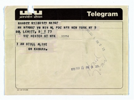
On Kawara,Telegram to Sol LeWitt, February 5, 1970, From I Am Still Alive, 1970–2000, Telegram, 5 3/4 x 8 inches (14.6 x 20.3 cm), LeWitt Collection, Chester, Connecticut
On Kawara, Telegram to Sol LeWitt, February 5, 1970, From I Am Still Alive, 1970–2000, Telegram, 5 3/4 x 8 inches (14.6 x 20.3 cm), LeWitt Collection, Chester, Connecticut

From 1966 until his death in June 2014, Kawara assiduously monitored and recorded his own passage through time and space in serial bodies of work, each of which was developed over the course of a number of years. Collectively, Kawara’s work accounts for time in various units: minutes, hours, days, years, centuries, and millennia. The legibility of Kawara’s chronicling activity is reliant upon the repetition of certain activities (mailing, listing, telegramming, painting) according to the self-imposed restrictions and conditions that limited the production of each distinct body of work: a Date Painting had to be completed within the span of twenty-four hours, the maps comprising I Went charted the artist’s movement in a given day, and each page included in One Million Years contained five hundred years typed into a grid formed by rows and columns.
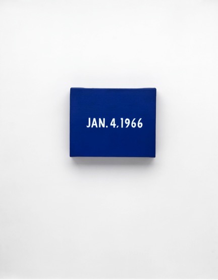
On Kawara, JAN. 4, 1966 “New York’s traffic strike.” New York, From Today, 1966–2013, Acrylic on canvas, 8 x 10 inches (20.3 x 25.4 cm), Private collection, Photo: Courtesy David Zwirner, New York/London

Rauschenberg’s Stoned Moon Lithographs: “Nothing Will Already Be The Same”

The words are Robert Rauschenberg’s, stripped-in alongside a photograph of Apollo 11 clearing its launch tower: “NOTHING WILL ALREADY BE THE SAME.” Oriented vertically, the typewritten phrase mimics the upward thrust of the rocket, setting it apart from all else within the composition of the page; it is one of twenty mock-ups of the artist’s never-realized Stoned Moon Book (1969), on loan from the Robert Rauschenberg Foundation. Conflating past and present by altering the idiom’s familiar uttering, Rauschenberg collapses the extraordinary long game of the space race and its attendant technological advancements with the instantaneousness of the liftoff. A presidential promise, made in 1961, is here loaded into the few anticipation-ridden seconds during which millions of Americans held their breath at exactly the same time.

Rauschenberg was one of them. NASA invited him, along with seven other artists, to Cape Canaveral in July 1969 to observe the launch of Apollo 11. Since 1967, Rauschenberg had been working with Los Angeles-based artists’ workshop Gemini G.E.L. (and making prints elsewhere since 1962). His familiarity with the printed medium and relationship with Gemini allowed him to continue that collaboration to produce an impressive suite of prints that reflected upon his experience—he was granted unrestricted access—of NASA’s astronauts, complex machinery, and sprawling facilities for the occasion of the first manned flight to the moon.

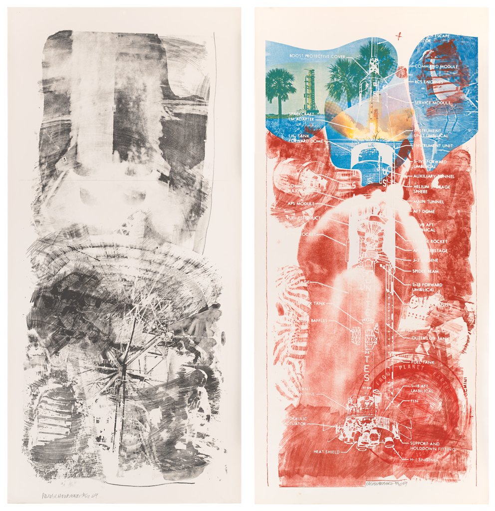
A single-gallery show at the Cantor Arts Center at Stanford University, “Loose in Some Real Tropics: Robert Rauschenberg’s ‘Stoned Moon’ Projects, 1969–70” (on view December 20, 2014 through March 16, 2015), exhibits thirteen of the thirty-four lithographs in the series, alongside rarely-seen archival material including photographs of Rauschenberg in the studio, notes he took during his visit to Florida, and twenty of the aforementioned collaged book pages. Taken together, they provide welcome access to the artist’s working process and state of mind. The show benefits from the clear focus of its curator, James Merle Thomas, who enables viewers to hone in on a discrete moment of intersection between artistic production and the shared experience of a monumental historical moment. The lithographs on view, in their varying degrees of abstraction, likewise represent a range of content, intelligibility, and what one could imagine as approximations of onlookers’ sensory impressions. The Stoned Moon works’ relative obscurity makes the Cantor’s a refreshing and gladly received showing, offering an even-keeled selection of the full series’ sensibility and iconography, even if it omits prints in the series that showcase the raw power and dynamism of the liftoff, that snapshot that best conveys the erupting anticipation of the Apollo mission. (It seems, indeed, that excitement was what Rauschenberg was after.) Missed in this regard, then, is a print like Waves (1969), whose vast surface is half-dominated by the enormous force of Saturn 5’s thrusters, surrounded by vapor-like exhaust that Rauschenberg inked in loose, brushy strokes.

Left: Robert Rauschenberg, Waves (Stoned Moon), 1969; lithograph, 89 in. x 42 in. (226.06 cm x 106.68 cm); Collection SFMOMA, Gift of Harry W. and Mary Margaret Anderson; © Robert Rauschenberg Foundation and Gemini G.E.L. / Licensed by VAGA, New York, NY; published by Gemini G.E.L. Image courtesy SFMOMA. Right: Robert Rauschenberg, Sky Garden (Stoned Moon), 1969; lithograph and screen print, 89 in. x 42 in. (226.06 cm x 106.68 cm); Collection SFMOMA, Gift of Harry W. and Mary Margaret Anderson; © Robert Rauschenberg Foundation and Gemini G.E.L. / Licensed by VAGA, New York, NY; published by Gemini G.E.L.  Image courtesy SFMOMA.
Left: Robert Rauschenberg, Waves (Stoned Moon), 1969; lithograph, 89 in. x 42 in. (226.06 cm x 106.68 cm); Collection SFMOMA, Gift of Harry W. and Mary Margaret Anderson; © Robert Rauschenberg Foundation and Gemini G.E.L. / Licensed by VAGA, New York, NY; published by Gemini G.E.L. Image courtesy SFMOMA. Right: Robert Rauschenberg, Sky Garden (Stoned Moon), 1969; lithograph and screen print, 89 in. x 42 in. (226.06 cm x 106.68 cm); Collection SFMOMA, Gift of Harry W. and Mary Margaret Anderson; © Robert Rauschenberg Foundation and Gemini G.E.L. / Licensed by VAGA, New York, NY; published by Gemini G.E.L. Image courtesy SFMOMA.

James Elkins in Conversation with Claire Brandon

Screen Shot 2015-02-18 at 9.14.55 AM
Screenshot of draft provided by James Elkins.

James Elkins, Professor in Art History, Theory, and Criticism at the School of the Art Institute of Chicago, delivered a lecture at the Institute of Fine Arts on February 10, 2015 as part of the Institute of Fine Art’s Daniel H. Silberberg Lecture Series. The lecture, “The End of the Theory of the Gaze,” explored the shortcomings of existing theories about the gaze and presented several aspects of Visual Worlds, the book that Professor Elkins is currently working on. IFA Ph.D. Candidate Claire Brandon spoke with Professor Elkins after the lecture.

Claire Brandon: Your lecture presented the failure of the theory of the gaze in the context of the new book you are working on, Visual Worlds.  Could you talk a little bit about the digital format for this project?  You mentioned that you and Erna Fiorentini are writing and editing this document using Google Drive, allowing for open-sourced authorship in some instances.  How does this process work?  How did you decide on Google Drive as a tool?

Screen Shot 2015-02-18 at 9.16.06 AM
Screenshot of Google Spreadsheet provided by James Elkins.

James Elkins: Well, we chose Google Drive (link here) just because it’s simple and it includes spreadsheets (which we need to keep track of word counts, illustrations, etc.). I have tried several WordPress sites, Nings (some are quite expensive), and other collaborative tools; they’re useful if you need video conferencing, separate discussion groups, etc.

The co-authoring part of the project works extremely smoothly: we have a document called “What’s new” where we exchange ideas; two spreadsheets to manage the many tasks of accumulating words, images, and arguments; a third spreadsheet for managing word counts; a document that records the Oxford Press “house style” (that’s something authors usually don’t see until the end, but we’re making our own “house style” for citations and usages).

Sturtevant: The Troublemaker

In early February, Curatorial Assistant Ingrid Langston and IFA MA Candidate Ashley McNelis toured the MoMA galleries. Langston assisted MoMA PS1 Curator Peter Eleey in organizing the exhibition Sturtevant: Double Trouble at MoMA, which runs from November 9, 2014 to February 22, 2015. Double Trouble is timely not just in light of the artist’s recent passing, but also because it is only Sturtevant’s second American-organized solo show since the 1970s. The intervening four decades—in which Sturtevant was largely ignored by the art world—have afforded her audience the time and hindsight to catch up with her intelligently penetrating vision. Sturtevant: Double Trouble also juxtaposes traditional art historical narratives (represented by works in MoMA’s permanent collection) against works from Sturtevant’s reactionary oeuvre. The exhibition will be on view in the third floor Special Exhibitions Gallery and the fifth floor Sue and Edgar Wachenheim III Painting and Sculpture Gallery at MoMA until it heads to the Museum of Contemporary Art in Los Angeles from March 21 to July 27, 2015.

Ashley McNelis: I understand that Sturtevant actively combated the use of curatorial strategies at other institutions. What was working with her at MoMA like?

Ingrid Langston: Unfortunately, I never got to meet her personally. She was working with Peter Eleey closely and was planning to come out for the installation before she passed away in May 2014. Peter went to Paris every few months to meet with her, but by the time I came on the project she was not really traveling much. So I never worked with her directly, which is a shame, but probably also made my life a lot easier. We did work closely with her daughter, Loren, too, who, along with her gallery in Paris, is the executor of the estate and the co-producer of Sturtevant’s video works.

In starting with the long hallway to the exhibition space that we were given, there is a puzzle right off the bat. It can be a challenge to draw people in and to make them understand that there’s an exhibition at the end. One of the very first pieces that Peter and Sturtevant placed was the dog, Finite Infinite (2010). It’s striking, like you’re literally running along with the dog down the hallway to the target at the end [Sturtevant’s Johns Target with Four Faces (study) (1986)]. The dog runs again and again into the wall; it’s endlessly repeating. It sets up the notion of the frustration of progress, related to how her whole project went against the idea of a straight, progressive narrative of art history.

Here, in Study for Muybridge Plate #97: Woman Walking (1966), she strides in front of the lens like in an Eadweard Muybridge, positioned in front of her own versions of Roy Lichtenstein, Andy Warhol, and James Rosenquist. It’s a nod to photography, the most “copying” medium. It’s about action, the circulation of images and the frustration of circular motion like this wallpaper of an owl whose head keeps turning. It’s so weird—we’re pretty sure she just grabbed it off the internet for her 2013 Serpentine show. The exhibition is trying to speak to the consistency of her project. It’s almost shocking how she stuck to her guns pretty much from 1964 when she began recreating the works of other artists.

Light, Smoke, and Acid: John Van Hamersveld on His Psychedelic Posters

On January 8, 2015, IFA PhD Candidate Elizabeth Buhe sat down with John Van Hamersveld in his Rancho Palos Verdes studio to discuss his work as a graphic designer, and, in particular, his 1960s psychedelic posters designed for Pinnacle Productions. 

ifacontemporary John Van Hamersveld in his San Pedro Studio January 2015
John Van Hamersveld in his San Pedro studio, January 2015. Photograph by the author.

EB: To start, why don’t you tell me a little about your artistic formation.

JVH: I was guided into graphic arts and communication of American and worldwide design at Art Center. At Art Center I would go to this store in Westwood called Flax, and they had an international magazine stand there. I was able to see even further how typographical design, photographs, and the communication process were European and went back to the Bauhaus. But then—boom—you know, it was something that was very contemporary and everywhere with Life Magazine and all that.

EB: So what years are we talking about here?

JVH: That’s in the 50s, from the 50s going into the 60s. 1961 I go to Art Center. The second part is that I leave Art Center early, one year after my education there, and I’m taking off the summer. My father gets me a job at Northrop Aviation. Between the director and himself, they guided me into publication making. They would make these books up that they’d show to generals on all the secret information on developing and testing. So at home, I decided after learning all that I can do my own surfing magazine. So I created a surfing magazine in my bedroom. I gathered up people from around the community and made the stories up, and then basically put it all together in my bedroom and took it down the street and had a printer—just an ordinary store-front printer—print it. So out of that, all the sudden, I was at Surfer Magazine. And then I was at another magazine called Surf Guide. So there’s three magazines that I’d been designing over a three-year period of time. I decided that I’m going to go to Chouinard, and get back into my art education. So I go to Chouinard, which is just turning into CalArts, and changing all of the sudden. At Chouinard I was anticipating becoming a painter, and I showed my canvases there. This was in 1965. The counselor who starts me out says you can take photography, you can take film, you can take video, and you can take animation. You can take all these other things that would be complementary to your communication classes of graphic design. So all the sudden it was like art! But it was media art. That was then developed into a thing called Pinnacle, which was this big promotion that I was able to do.

EB: Right. Before we start with Pinnacle, can we go back to some of your earlier influences?

Confronting the Burdens of Chronology: The Forever Now at MoMA

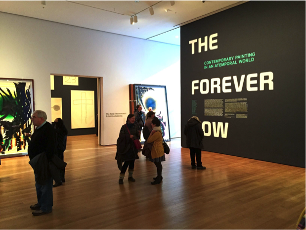
Proclaiming the current cultural moment as one in which all historical eras coexist, The Forever Now: Contemporary Painting in an Atemporal World (on view December 14, 2014 to April 5, 2015) constitutes the Museum of Modern Art’s first survey of contemporary painting in over thirty years. Occupying half of the museum’s uppermost floor, The Forever Now presents works by seventeen international living artists that is grounded in art historical references but shuns the constraints of art historical chronology. While vibrant and engaging, an exhibition of such stature merits criticism concerning the market-driven nature of much modern-day painting. The show asserts a-temporality as its theoretical basis, appearing first and foremost as MoMA’s unwavering and bold (though risky) attempt to take seriously—and defend—painting when its integrity is severely undermined by the whopping demands of the ever-expanding contemporary art market.

Exhibition entrance at the Museum of Modern Art.

The Forever Now presents painting in the wake of the proliferated image and Internet culture, drawing its thesis from the definition of “a-temporality” (or timelessness) first proposed by science fiction writer William Gibson. In the words of curator Laura Hoptman, the artists represented in the show relieve their art of “modernism’s burden of progress.”[1] The exhibition features predominantly abstract works in diverse media. Striving to present a multitude of inspirations and styles in an a-temporal world, the curators (Hoptman with curatorial assistant Margaret Ewing) provide the viewer an opportunity to experience timeless art in full scale. There are, among other works, Joe Bradley’s crude drawings on canvas, Julie Mehretu’s grey scribble paintings, Oscar Murillo’s colorful patchworks, and Mary Weatherford’s striking neon works. All of them are large, vibrant, and audacious, as if openly making the declaration: painting is alive and well.

FN2
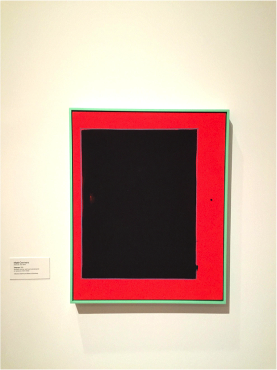
Matt Connors, Telescope, 2014.

A Conversation with Joshua Shannon

On December 2, 2014, University of Maryland Professor Joshua Shannon delivered a lecture entitled “Photorealism: A History of Surfaces” as part of the Institute of Fine Art’s Daniel H. Silberberg Lecture Series.  (A recording of his talk can be viewed here.)  The theme of the Silberberg lecture series this year is “failure,” and Professor Shannon’s presentation on photorealism took the failure of credibility suffered by humanist painting in the late twentieth century as a point of departure.  IFA Ph.D. Candidate Claire Brandon interviewed Professor Shannon following the lecture.

Joshua Shannon's lecture, "Photorealism: A History of Surfaces," in the lecture hall of the IFA.
Joshua Shannon’s lecture, “Photorealism: A History of Surfaces,” at the IFA.

In the beginning of your lecture, you mentioned 1968 as the starting point for your study.  What was happening with the practice of photorealism during that moment?  How do you see it as marking such a major shift in painting?

Photorealism made a rather sudden appearance in painting in 1967-68.  Most of the photorealists had been making other kinds of realist painting in the years just before then, but it is amazing to see how suddenly—and simultaneously—many of them began to make paintings that acknowledged, even exaggerated, the fact that that they were based on photographs.  This struck me as a fact needing some historical explanation.

Why have you chosen to focus on Robert Bechtle?  How can his work be differentiated from the other photorealists you brought up, such as Chuck Close, Richard Estes, and Ralph Goings?

I just think Bechtle made many of the richest and most revealing paintings.  The photorealists are united by the fact that they all make clear that they have painted from photographs, but the kinds of photographs they work from are actually quite diverse.  While Estes, for example, uses urban architectural photography and Close uses portrait photographs, Bechtle works from snapshots.  His paintings are deliberately exploring amateur photography, even mediocre amateur photography.  Bechtle is interested not so much in precision or in dryness as he is in posing.  His paintings are about self-presentation, and about what counts as a good or meaningful picture.  As such, Bechtle has his fingers on many of the most important problems in visual representation over the past several decades.  We have so much to learn from his paintings.

A Rendez-vous with Philippe de Montebello

Following a thirty-two-year tenure as Director of the Metropolitan Museum of Art, Philippe de Montebello has been, since 2009, Fiske Kimball Professor in the History and Culture of Museums at the Institute of Fine Arts. Also in that year, Professor de Montebello became the first scholar in residence at the Prado Museum in Madrid, and, among his many other honors and awards for his contributions to the arts, was recently named to the Board of Trustees of the Prado and the Musée d’Orsay. On November 21, 2014, IFA Master’s student Jennie Sirignano sat down with Professor de Montebello to discuss his newly-published book, Rendez-vous with Art.

Philippe de Montebello in his office at the Met. Photograph by Lee Clower. Image courtesy W Magazine.

Jennie Sirignano: Professor de Montebello, thank you for meeting with me. In your new book Rendez-vous with Art, you mostly focus on ancient and European works of art. Was it a conscious choice to not include discussions of contemporary art?

Philippe de Montebello: We just happened to not go to certain places. I didn’t go to the National Gallery in London. I didn’t go to the Uffizi. For over two and a half years, Martin and I would call each other and say “I’m going to Florence for a conference—can you be there?” And so we happened to be in Florence, and me in Madrid because I am on the board of the Prado, and he never had more than one day, nor me more than one day, so we limited it. I would have loved to do the Musée du Moyen Âge in Paris at Cluny. I never got around to it. I could have spent a great deal of time in MoMA looking at things I love. Not contemporary, it would have been more Modern. Contemporary I don’t understand very well, but if I do a second book with him, which I don’t think I will because I don’t think it’s necessary, I would do medieval, I would do Islamic, and we would cover many of the things we haven’t. This serves in a way as a kind of travel guide for people who want to go around and look at art. I don’t know. I am not sure it serves anything.

JS: Well, you have described your decision to dedicate the majority of your professional life to museum work as wishing to “above all share my passion with others, many others.” Does Rendez-vous with Art have a similar genesis?

Three Shades of Chris Ofili

Like the three fantastic realms of the afterlife in Dante’s Divine Comedy, the New Museum’s current exhibition, Chris Ofili: Night and Day (on view until January 25, 2015), is divided into three distinctly different gallery spaces that challenge viewers to interact with each work in intensely visual, meditative, and thought-provoking ways. The retrospective traces Ofili’s trajectory as a painter over the past two decades, demonstrating his development as an artist who masterfully creates technically complex compositions to address ideas of black culture, female stereotypes, and history. Via the use of controlled environments, curators Massimiliano Gioni, Gary Carrion-Murayari, and Margot Norton have proven that the impact of a work of art is often determined by the setting in which it is displayed.

Chris Ofili, The Holy Virgin Mary, 1996. Paper collage, oil paint, glitter, polyester resin, map pins & elephant dung on linen, 96 x 72 in. Photograph by the author.

This isn’t the first time Ofili’s work has been exhibited in New York City. Much to then-Mayor Rudolph Giuliani’s outrage, Ofili’s The Holy Virgin Mary (1996) was displayed at the Brooklyn Museum of Art in 1999 as part of Charles Saatchi’s exhibition Sensation. The former mayor, who called Ofili’s work “sick,” wasn’t alone in his protest; many visitors were deeply offended by Ofili’s daring representation of the Virgin Mary, whose right breast is formed of the now-infamous elephant dung and whose body is surrounded by magazine clippings of female buttocks. In his ire, Dennis Heiner, a seventy-two-year old Catholic Brooklynite, vandalized the work by smearing white paint over it. Fifteen years later, in his first major solo museum exhibition in the United States, Ofili proves that rather than hinder his artistic career, the controversy helped to establish him as one of the most provocative artists of his day.