Press "Enter" to skip to content

Posts published in “Reviews”

Rauschenberg’s Stoned Moon Lithographs: “Nothing Will Already Be The Same”

The words are Robert Rauschenberg’s, stripped-in alongside a photograph of Apollo 11 clearing its launch tower: “NOTHING WILL ALREADY BE THE SAME.” Oriented vertically, the typewritten phrase mimics the upward thrust of the rocket, setting it apart from all else within the composition of the page; it is one of twenty mock-ups of the artist’s never-realized Stoned Moon Book (1969), on loan from the Robert Rauschenberg Foundation. Conflating past and present by altering the idiom’s familiar uttering, Rauschenberg collapses the extraordinary long game of the space race and its attendant technological advancements with the instantaneousness of the liftoff. A presidential promise, made in 1961, is here loaded into the few anticipation-ridden seconds during which millions of Americans held their breath at exactly the same time.

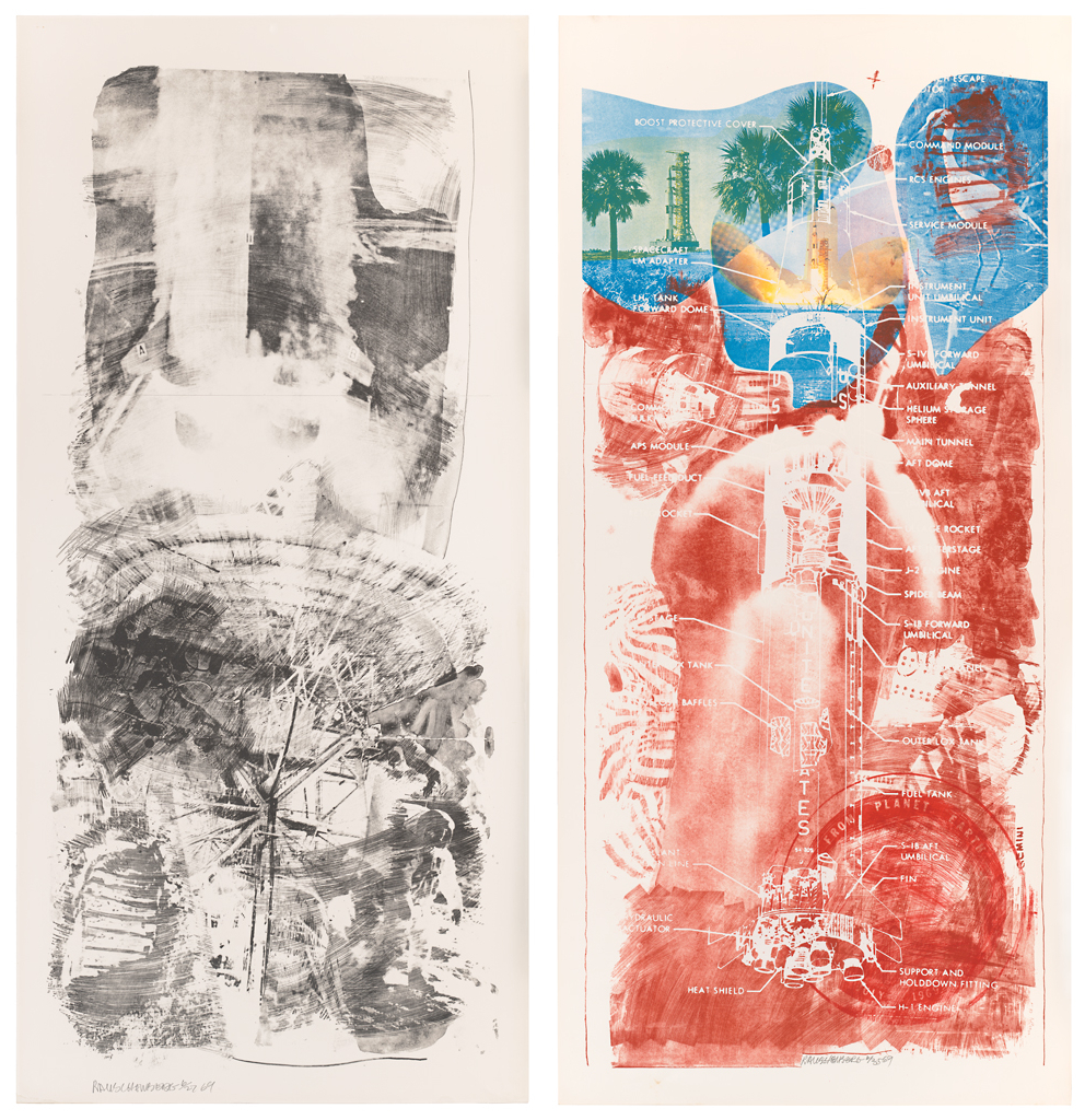
Rauschenberg was one of them. NASA invited him, along with seven other artists, to Cape Canaveral in July 1969 to observe the launch of Apollo 11. Since 1967, Rauschenberg had been working with Los Angeles-based artists’ workshop Gemini G.E.L. (and making prints elsewhere since 1962). His familiarity with the printed medium and relationship with Gemini allowed him to continue that collaboration to produce an impressive suite of prints that reflected upon his experience—he was granted unrestricted access—of NASA’s astronauts, complex machinery, and sprawling facilities for the occasion of the first manned flight to the moon.

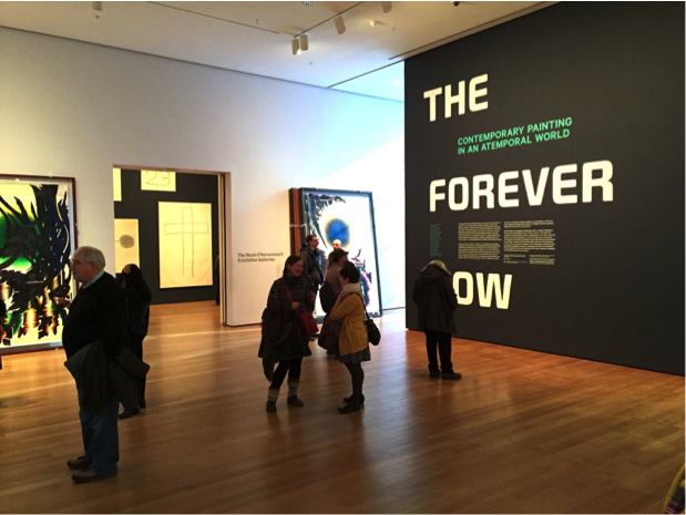
A single-gallery show at the Cantor Arts Center at Stanford University, “Loose in Some Real Tropics: Robert Rauschenberg’s ‘Stoned Moon’ Projects, 1969–70” (on view December 20, 2014 through March 16, 2015), exhibits thirteen of the thirty-four lithographs in the series, alongside rarely-seen archival material including photographs of Rauschenberg in the studio, notes he took during his visit to Florida, and twenty of the aforementioned collaged book pages. Taken together, they provide welcome access to the artist’s working process and state of mind. The show benefits from the clear focus of its curator, James Merle Thomas, who enables viewers to hone in on a discrete moment of intersection between artistic production and the shared experience of a monumental historical moment. The lithographs on view, in their varying degrees of abstraction, likewise represent a range of content, intelligibility, and what one could imagine as approximations of onlookers’ sensory impressions. The Stoned Moon works’ relative obscurity makes the Cantor’s a refreshing and gladly received showing, offering an even-keeled selection of the full series’ sensibility and iconography, even if it omits prints in the series that showcase the raw power and dynamism of the liftoff, that snapshot that best conveys the erupting anticipation of the Apollo mission. (It seems, indeed, that excitement was what Rauschenberg was after.) Missed in this regard, then, is a print like Waves (1969), whose vast surface is half-dominated by the enormous force of Saturn 5’s thrusters, surrounded by vapor-like exhaust that Rauschenberg inked in loose, brushy strokes.

Left: Robert Rauschenberg, Waves (Stoned Moon), 1969; lithograph, 89 in. x 42 in. (226.06 cm x 106.68 cm); Collection SFMOMA, Gift of Harry W. and Mary Margaret Anderson; © Robert Rauschenberg Foundation and Gemini G.E.L. / Licensed by VAGA, New York, NY; published by Gemini G.E.L. Image courtesy SFMOMA. Right: Robert Rauschenberg, Sky Garden (Stoned Moon), 1969; lithograph and screen print, 89 in. x 42 in. (226.06 cm x 106.68 cm); Collection SFMOMA, Gift of Harry W. and Mary Margaret Anderson; © Robert Rauschenberg Foundation and Gemini G.E.L. / Licensed by VAGA, New York, NY; published by Gemini G.E.L.  Image courtesy SFMOMA.
Left: Robert Rauschenberg, Waves (Stoned Moon), 1969; lithograph, 89 in. x 42 in. (226.06 cm x 106.68 cm); Collection SFMOMA, Gift of Harry W. and Mary Margaret Anderson; © Robert Rauschenberg Foundation and Gemini G.E.L. / Licensed by VAGA, New York, NY; published by Gemini G.E.L. Image courtesy SFMOMA. Right: Robert Rauschenberg, Sky Garden (Stoned Moon), 1969; lithograph and screen print, 89 in. x 42 in. (226.06 cm x 106.68 cm); Collection SFMOMA, Gift of Harry W. and Mary Margaret Anderson; © Robert Rauschenberg Foundation and Gemini G.E.L. / Licensed by VAGA, New York, NY; published by Gemini G.E.L. Image courtesy SFMOMA.

Confronting the Burdens of Chronology: The Forever Now at MoMA

Proclaiming the current cultural moment as one in which all historical eras coexist, The Forever Now: Contemporary Painting in an Atemporal World (on view December 14, 2014 to April 5, 2015) constitutes the Museum of Modern Art’s first survey of contemporary painting in over thirty years. Occupying half of the museum’s uppermost floor, The Forever Now presents works by seventeen international living artists that is grounded in art historical references but shuns the constraints of art historical chronology. While vibrant and engaging, an exhibition of such stature merits criticism concerning the market-driven nature of much modern-day painting. The show asserts a-temporality as its theoretical basis, appearing first and foremost as MoMA’s unwavering and bold (though risky) attempt to take seriously—and defend—painting when its integrity is severely undermined by the whopping demands of the ever-expanding contemporary art market.

Exhibition entrance at the Museum of Modern Art.

The Forever Now presents painting in the wake of the proliferated image and Internet culture, drawing its thesis from the definition of “a-temporality” (or timelessness) first proposed by science fiction writer William Gibson. In the words of curator Laura Hoptman, the artists represented in the show relieve their art of “modernism’s burden of progress.”[1] The exhibition features predominantly abstract works in diverse media. Striving to present a multitude of inspirations and styles in an a-temporal world, the curators (Hoptman with curatorial assistant Margaret Ewing) provide the viewer an opportunity to experience timeless art in full scale. There are, among other works, Joe Bradley’s crude drawings on canvas, Julie Mehretu’s grey scribble paintings, Oscar Murillo’s colorful patchworks, and Mary Weatherford’s striking neon works. All of them are large, vibrant, and audacious, as if openly making the declaration: painting is alive and well.

FN2
Matt Connors, Telescope, 2014.

Three Shades of Chris Ofili

Like the three fantastic realms of the afterlife in Dante’s Divine Comedy, the New Museum’s current exhibition, Chris Ofili: Night and Day (on view until January 25, 2015), is divided into three distinctly different gallery spaces that challenge viewers to interact with each work in intensely visual, meditative, and thought-provoking ways. The retrospective traces Ofili’s trajectory as a painter over the past two decades, demonstrating his development as an artist who masterfully creates technically complex compositions to address ideas of black culture, female stereotypes, and history. Via the use of controlled environments, curators Massimiliano Gioni, Gary Carrion-Murayari, and Margot Norton have proven that the impact of a work of art is often determined by the setting in which it is displayed.

Chris Ofili, The Holy Virgin Mary, 1996. Paper collage, oil paint, glitter, polyester resin, map pins & elephant dung on linen, 96 x 72 in. Photograph by the author.

This isn’t the first time Ofili’s work has been exhibited in New York City. Much to then-Mayor Rudolph Giuliani’s outrage, Ofili’s The Holy Virgin Mary (1996) was displayed at the Brooklyn Museum of Art in 1999 as part of Charles Saatchi’s exhibition Sensation. The former mayor, who called Ofili’s work “sick,” wasn’t alone in his protest; many visitors were deeply offended by Ofili’s daring representation of the Virgin Mary, whose right breast is formed of the now-infamous elephant dung and whose body is surrounded by magazine clippings of female buttocks. In his ire, Dennis Heiner, a seventy-two-year old Catholic Brooklynite, vandalized the work by smearing white paint over it. Fifteen years later, in his first major solo museum exhibition in the United States, Ofili proves that rather than hinder his artistic career, the controversy helped to establish him as one of the most provocative artists of his day.

The Veil of Cy Twombly

Cy Twombly was living in Rome when he painted Treatise on the Veil (Second Version), a massive canvas now on view at The Morgan Library & Museum (through January 25, 2015). It was 1970, four years after he’d delved headfirst into a world ruled seemingly absolutely by gray and white. Twombly’s shift in style could be seen as a return to the “blackboard” aesthetic he’d first pioneered in the mid-1950s with three thickly impastoed, staccatoed canvases, only one of which (Panorama, 1955, Daros Collection, Zurich) survives today. But the artist’s gray-ground period, a five-year stint between 1966 and 1971, illustrates an abandonment of the caustic scratches of his earlier work in favor of a line that is less fragmented and more fluid, less automatic and more calculated, less shrill and more lyrical. Indeed, Treatise was inspired by Pierre Henry’s avant-garde musical composition, The Veil of Orpheus, which records the tearing of a piece of cloth. In his translation of aural to visual phenomena, Twombly reduces his subject matter to its simplest parts, distilling and crystallizing its formal components so as to strengthen its visceral effects.

Cy Twombly’s canvases (including Panorama at back) in Robert Rauschenberg’s Fulton Street studio, ca. 1954.  Image courtesy Le temps retrouvé, Cy Twombly photographe & artistes associés, Collection Lambert (Avignon, été-automne 2011) via The Plumebook Café.
Photograph showing Cy Twombly’s canvases (including Panorama at back) in Robert Rauschenberg’s Fulton Street studio, ca. 1954. Image courtesy Le temps retrouvé, Cy Twombly photographe & artistes associés, Collection Lambert (Avignon, été-automne 2011) via The Plumebook Café.

The Morgan’s installation beautifully captures the visual harmony of Twombly’s work. In all its epic grandeur (the canvas stretches more than thirty feet), Treatise sits in the center of a single gallery, a crescendo amidst a twelve-drawing accompaniment. The drawings radiate centrifugally onto the surrounding walls, at once bracketing and barricading their attendant canvas. About twenty-seven by thirty-six inches each, the drawings are supplementary but not preparatory, and they are positioned as such: separate but equal. As the introductory text asserts, rightly, Treatise is “a meditation on time and space.”[1] The curators have done well to bolster these temporal underpinnings by orchestrating the drawings in approximate chronological order. But the sheer scale of Treatise, hubristic in its spatial demands, along with its diaphanous layers of media suggests something deeper stirs beneath the painting’s surface.

Cy Twombly, Nine Discourses on Commodus: Part VIII, 1963. Oil, wax crayon, and pencil on canvas, 204 x 134 cm. Image courtesy Guggenheim Bilbao Museoa.

Biomorphic, Electric, Robotic: Nam June Paik at Asia Society

“The real issue is not to make another scientific toy, but how to humanize the technology and the electric medium.” – Nam June Paik, 1964

The staircase at the Asia Society Museum leads to an enlarged, transparent image of Nam June Paik sitting between two illuminated globes, contemplatively with chin in hand, wearing miniature televisions inset in a pair of eyeglasses. The image exemplifies the artist’s prescient thinking and his futuristic worldview wherein today’s technological advancements could exist. It is a fitting introduction to Nam June Paik: Becoming Robot (through January 4, 2015), the first solo exhibition of the artist’s work in New York in over a decade. The exhibition, designed by Clayton Vogel and curated by Michelle Yun, is an effort to broaden the understanding of Paik’s practice beyond his legacy as the originator of video art in the 1960s, and to situate his use of technology as a medium within the wider framework of late twentieth- and early twenty-first-century art.

Paik, born in Seoul in 1932, studied music and aesthetics at Tokyo University and went on to continue his musical studies in Germany, where he met visiting composer John Cage, who largely inspired Paik’s experimentation in avant-garde music and art. Moving to New York in 1964, Paik began working mainly on music-based live performances until his experimentation with televisions catalyzed the shift in his practice to object-based work.

Robot K-456, 1964. Twenty-channel radio-controlled robot, aluminum profiles, wire, wood, electrical divide, foam material, and control-turn out. 72 x 40 x 28 in. (183 x 103 x 72 cm). Friedrich Christian Flick Collection im Hamburger Bahnof, PAIKN1792.01. Photo: Roman März, Berlin.

The exhibition at the Asia Society spans the entirety of the museum’s two floors. Moving thematically through Paik’s oeuvre, the show begins with a section dedicated to Robot K-456, a twenty-channel radio-controlled robot created in 1964 and crafted with aluminum, wire, wood, electrical divide, foam material, and control-turn out. Based in human proportions, the biomorphic assemblage was programmed to walk and talk and was the subject of numerous performance-based projects. Presented on a simple screen set into the gallery wall (which successfully differentiates it from Paik’s own TV-based works) is a news account of First Accident of the Twenty-First Century, which was performed in 1982 on the occasion of the artist’s major exhibition at the Whitney Museum. The choreographed piece subjects the robot to a car accident while crossing Madison Avenue at 75th Street. As the robot falls to the ground in the footage, the beholder hears distressed shouts, proving that Paik has created a subject biomorphically familiar enough as to incite empathetic reactions. At a time when technology was advancing into a more pervasive component of daily life, humanizing the medium was Paik’s attempt at making it more approachable. The work’s reception in television media muddied the line between art and popular culture, and the piece itself reiterates Paik’s intention of manifesting the human condition through the mediums of science and technology.

An Exchange of Trust: Marina Abramović at Sean Kelly Gallery

Marina Abramović is back in New York City, but this time, she won’t be seen. On her last visit, Abramović performed The Artist is Present (2010) for the blockbuster MoMA retrospective of the same name. For 736 hours and 30 minutes, Abramović sat immobile in MoMA’s atrium faced, one by one, by silent visitors. Most recently, she spent 512 hours at the Serpentine Gallery, guiding visitors through an empty space and occasionally presenting them with an everyday object.

The author cautiously moving through the space. Image courtesy of Generator by Marina Abramović.

Now, at Sean Kelly Gallery, Abramović’s Generator—a participatory work that focuses on “nothingness” and sensory deprivation—is on view (through December 6, 2014). Facilitators place blindfolds and noise-cancelling headphones on participants before leading them into the main gallery. Once inside, participants can move however they want (though told it is a “slow-moving” piece), touch whatever they want, and stay as long as they want. When ready to leave, the blindfolded raise their hands and a facilitator guides them out. Every movement is documented and presented on Tumblr; this aspect of the piece, however, only becomes apprehensible once outside the space, in front of a computer screen. During the exhibition’s run, Abramović will partake, too—unannounced and daily—but, of course, participants will not be aware of her presence.

Unfurling Sari Dienes

The exhibition of Sari Dienes’s work at The Drawing Center (on view October 8 to November 16, 2014) highlighted the artist’s innovative and experimental approaches to mark making in her large-scale rubbings of New York City streets from the 1950s. On November 13, the curators of the exhibition (and current PhD candidates at the IFA), Alexis Lowry Murray and Delia Solomons, led a public tour that introduced Dienes’s work by examining the dynamic interplays of processes and textures in her drawings. During the tour, Solomons and Lowry Murray gave context to Dienes’s practice by underscoring her creative exchanges with contemporaries such as Jasper Johns and John Cage. Following the tour, artists Alison Knowles and Gillian Jagger talked with NYU’s Julia Robinson about their mutual interests in using found forms and textures from natural and urban landscapes in their work.

Peter Moore, photograph of Sari Dienes demonstrating the street rubbing process, 1970. Gelatin silver print, 6.5 x 9.75 in.

Sari Dienes (1898—1992) was born in Hungary and was a student of Purists Fernand Léger and Amédée Ozenfant. By 1936, she was Assistant Director of Ozenfant Academy of Fine Arts in London. She moved to New York City in 1939 where she soon befriended artists both established (Mark Rothko) and emerging (Johns and Cage, as well as Ray Johnson, Robert Rauschenberg, and others), many of whose names are listed in pages from the guest book from her studio. On Thursday night, Lowry Murray and Solomons emphasized Dienes’s willingness to experiment with found materials and new processes, and her subversive recoding of established notions of the authorial gesture, qualities that are as important today as they were to Dienes and her contemporaries as seen, for example, in the work of Ray Johnson, Rachel Whiteread, and Rirkrit Tiravanija.

Challenging Gridlock for Gridwork: A Trip to Harlem for Early Charles Gaines

The current exhibition at the Studio Museum in Harlem, Charles Gaines: Gridwork 1974-1989 (on view through October 26, 2014), encompasses an era of the artist’s work before he began confronting social content and identity head-on, as in the 1993 exhibition and publication, The Theater of Refusal: Black Art and Mainstream Criticism, which examined racial determinism in the artworld at that time. Despite the fact that the exhibition catalog and wall texts at the Studio Museum explain Charles Gaines as an artist who explores the “relationship between aesthetics, politics, language and systems,” the political and racial implications seem absent in this period of his oeuvre, or at least buried deep within systematical and conceptual thinking.

Charles Gaines Motion: Trisha Brown Dance, Set #1, 1980–81 Collection of James Keith Brown and Eric Diefenbach Courtesy Susanne Vielmetter Los Angeles Projects Photo by Robert Wedemeyer.
Charles Gaines, Motion: Trisha Brown Dance, Set #1, 1980–81. Collection of James Keith Brown and Eric Diefenbach. Courtesy Susanne Vielmetter Los Angeles Projects. Photo by Robert Wedemeyer. Image courtesy the Studio Museum.

One familiar with the aim of the Studio Museum – as well as Gaines’s more contemporary works – might anticipate a different body of work, one that confronts more evidently the “influence or inspiration from black culture,” as per the Museum’s mission statement. Rather, methodology and conceptualism – an influence likely stemming from Sol LeWitt, a major influence in Gaines’s career – come to the fore. The walls of the first room of the exhibition are lined with artworks featuring massive grids, among which are the key series Regression (1973-74), Color Regression (1978), and Numbers and Trees (1986-89). The impressive scale of a majority of the work is tempered by the delicate, precise handwriting that embellishes their grids and margins. But the monumentality of Gaines’s work has less to do with its physical size than the painstaking process that produced it. As the shapes and colors in the Regression drawings vary, it becomes apparent that each is driven by arithmetical operations, building upon each other and constructing systems similar to self-referential fractals.

Painting the Infinite: Roman Opalka at Dominique Lévy

The show at Dominique Lévy is Roman Opalka’s first U.S. exhibition after the artist’s sudden death in 2011. Divided between two floors of the gallery’s Upper East Side brownstone building, Roman Opalka: Painting ∞ provides a synopsis of the artist’s career by showcasing over twenty five works in different media. Although Opalka’s art may at first appear modest, this show proves its uniqueness and complexity. By focusing on the artist’s inimitable technique, Roman Opalka: Painting ∞ offers insight into his scrupulous and orderly approach to Conceptual art.

Second Floor Installation View of Roman Opalka: Painting ∞ at Dominique Lévy. Courtesy of Dominique Lévy. Photo credit: Guillaume Ziccarelli.

Opalka, who was born in France but raised and educated in Poland, began his artistic career in Warsaw during the late 1950s by experimenting with the “phenomenon of disappearance.”[1] The gallery’s third floor, devoted entirely to Opalka’s earlier works, presents the effects of these experiments with two of his 1963 black-and-white Chronome paintings and the series Étude sur le Mouvement (1959-1960), made with black ink on paper. As one walks around the room, the artworks reveal themselves as precursors to Opalka’s later work in their conscientious method of execution and monochromatic aesthetic. The smudges of ink in Étude sur le mouvement, though visibly influenced by gestural works of the American Abstract Expressionists and their European counterparts, the Tachists, reveal his fascination with repetitive patterns. Across the room, two tempera paintings from 1963, Chronome II and Chronome IV, present an intertwining of black and white spots, creating a nearly monochromatic surface.

Images of Struggle and Resilience: Ernest Cole at the Grey

All photographs date from the early 1960s through 1966.

In 1990, the South African court justice Albie Sachs famously penned an essay called “Preparing Ourselves For Freedom” in which he argued for a return to beauty in the arts, and an expansion of creativity beyond the decades of revolutionary cultural work aimed at supporting the anti-apartheid struggle. While the lifelong activist knew firsthand that political engagement had long been a matter of survival, he asserted that the repeated imagery of “fists, spears, and guns” might limit the creative imagination of the new South Africa, that “the range of themes is narrowed down so much that all that is funny or curious or genuinely tragic in the world is extruded. Ambiguity and contradiction are completely shut out.”[1]   Be that as it may, there will always be those rare, inspired cases in which the political and the beautiful need not be mutually exclusive, where complexity and ambivalence are found in the most seemingly black-and-white circumstances. The work of South African photojournalist Ernest Cole (1940-1990) offers one such example. His work betrays a deep commitment to both social and aesthetic engagement, which come together in a stunning portfolio of photographs that documents life under apartheid and pays homage to the persistence of humanity through struggle.

Ernest Cole: Photographer, organized by the Hasselblad Foundation and currently on view at NYU’s Grey Art Gallery through December 6th, is the first museum retrospective of Ernest Cole’s work, and one that is long overdue. The artist risked his life and ultimately sacrificed his citizenship in order to produce his seminal photobook House of Bondage, which remains one of the most visually powerful and politically incisive documents of the apartheid era.

Cole considered it his life’s work to chronicle the black experience from every angle: public and private, at work and at home, and inclusive of the perspectives of men, women, children, and families. He envisioned his target audiences to be foreigners – Europeans and Americans – both in the hopes of revealing the horrors of apartheid to the outside world, and in full knowing that he would never be able to distribute his work domestically (even today, the book is less known in South Africa than it is in the West, having only been published in New York and London in 1967). Across this presentation of over one hundred images, shot throughout the 1960s, we bear witness to not only the gross indignities inflicted on black South Africans by the apartheid system, but also a collection of more intimate, everyday moments that humanize and honor Cole’s subjects.

Ernest Cole, "Township mother fights losing battle to keep son, age nine, from running off to live life of the streets. She tries to assert authority with threats: 'What's your future going to be like without an education?' But it is too late; the boy - called Papa - is out of control." - House of Bondage, 1967. Silver gelatin print, 7 7/8 x 11 3/8 in. © The Ernest Cole Family Trust. Image courtesy the Hasselblad Foundation.
Ernest Cole, “Township mother fights losing battle to keep son, age nine, from running off to live life of the streets. She tries to assert authority with threats: ‘What’s your future going to be like without an education?’ But it is too late; the boy – called Papa – is out of control.” Caption from House of Bondage, 1967. Silver gelatin print, 7 7/8 x 11 3/8 in. © The Ernest Cole Family Trust. Image courtesy the Hasselblad Foundation.